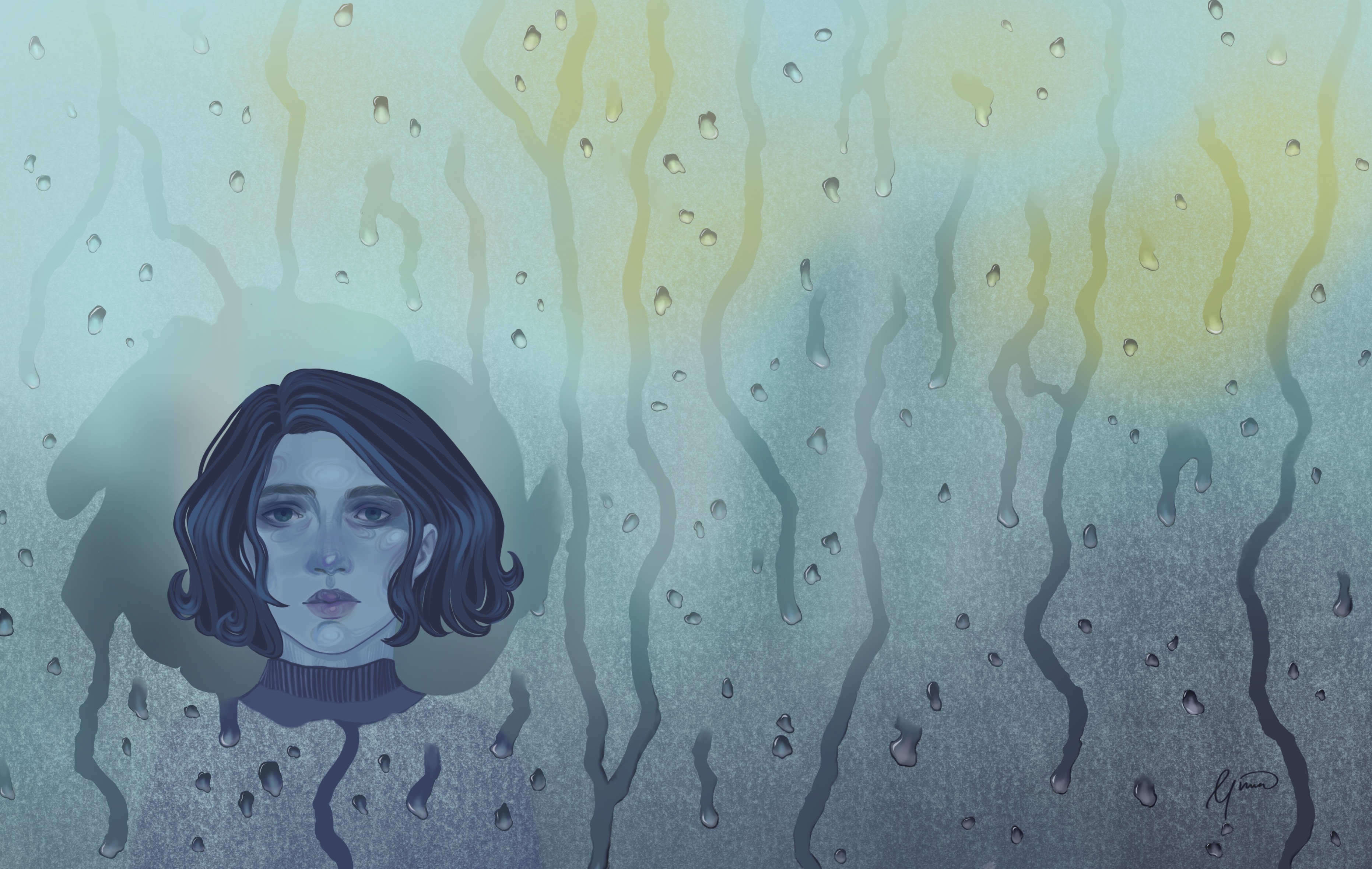
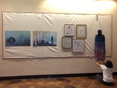
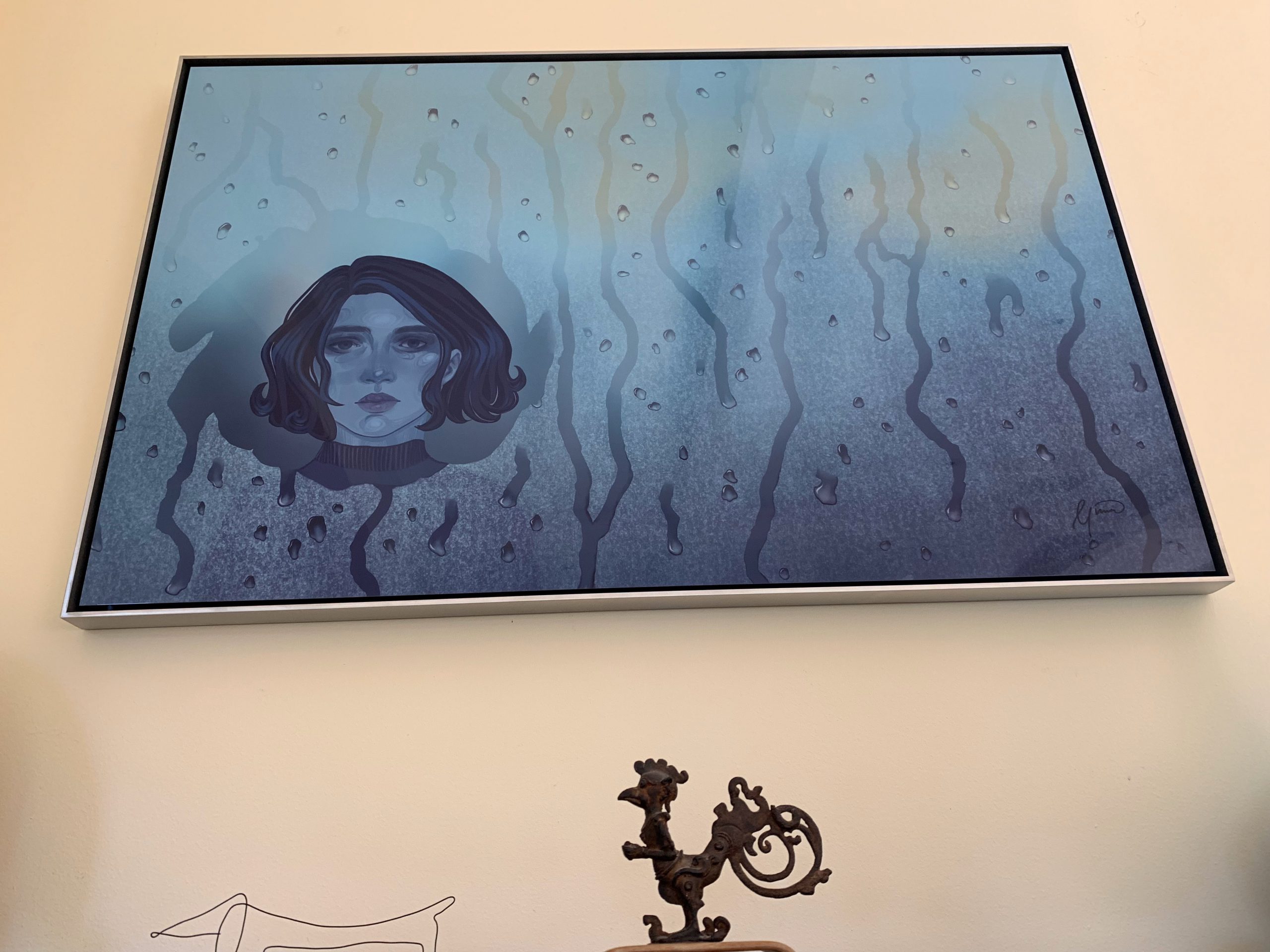
This was one of two pieces meant to show the invisible divide between some people with mental illness and the rest of the world. This one showed how lonely and apart people feel. The girl used her finger to wipe the fog away so she could see through to other people and people could see her. -Gina
Artist: Gina Ledor (2002 — )
Date: 2019
Medium: Digital painting (Apple Pencil on iPad Pro with Procreate graphic software) over imported pencil drawing
Dimensions: Optional. On paper, the maximum available size is 43.6 x ~67″. On aluminum, the maximum is 48 x ~74″. The first prints have been 61.0 x 96.5 cm, 24 x 38” on aluminum.
Matrix: Printing is available in UV-protected glossy (or other) aluminum or in a choice of papers
Edition: This is a limited edition with printing to order by Bay Photo (Scotts Valley, CA). To date, one artist’s proof has been printed on glossy aluminum (to be hand-signed at the time of sale) and a second, digitally signed proof has been printed on glossy, UV-filtering (EXT) aluminum. The total edition will likely remain below 100 numbered proofs.
Signature: Hand-signed and numbered by the artist at the time of sale for proofs on archival paper, if any; for proofs on UV-filtering aluminum, digitally hand-signed and numbered by the artist at the time of sale. One artist’s proof exists on glossy regular (non-EXT) aluminum, to be hand-signed at the time of sale.
Exhibition history: Berkeley High School, Berkeley, CA, April 17-30, 2019
Condition: Pristine
Framing: Optional; available in a choice of frames, ranging from a simple hidden, inset frame (which provides the support structure for a picture wire) to a custom, patinated aluminum frame
Price: Upon request
Below is Gina’s artist’s statement, referring to a cohesive body of work she has created for her high school art class exhibition. This digital painting is one of two related pieces, which Gina envisioned together from the start. The companion piece, a view from the other side of the glass, also featured in her exhibit and is viewable on its own page here, or in the lower-rez images above.
Art as Coping
A year and a half ago, I heard that my friend had taken his own life. This came as a great shock, as I had known him as a cheerful, bubbly person who made everyone laugh–the last person I would ever have expected to have been depressed. I entered a long period of mourning, and it seems the loss I feel will always remain with me. Since then, my awareness of and attitude toward mental illness have evolved. Because of the disparity between his outgoing personality and the sadness he hid beneath the surface, I began to realize that there is much that people don’t know about each other. Now I pay much more attention to the mental health of those around me. I have become aware that because of the stigma surrounding mental illness, those suffering from it feel isolated and often keep their troubles to themselves.
I make art in the hopes of contributing to the creation of an environment that allows people to talk about their struggles and seek help. To this end, I try to understand those around me who have experienced emotional distress and to explore their coping mechanisms. The meaning in my work comes from the process of making art itself as much as the final product itself—creating is one of the best mechanisms I have for coping. The creation of each piece in itself is an outlet.
I tend to draw faces a lot. I think the reason is that often, facial expressions unwittingly reveal underlying emotions that people are trying to hide.
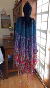
The friend I lost loved to knit, and I often saw him knitting scarves and promptly unraveling them. He always said it was simply because he wasn’t happy with them, but, looking back, I think it was his way of coping. I wanted to make a piece representing both that and the way someone’s life can unravel. The process of crocheting, much like my incessant doodling, was a place I could escape to, and I found comfort in the repetitive patterns of crochet. The unraveling of my piece is a reflection of the way my friend knitted and a metaphor for his despair.
-Gina
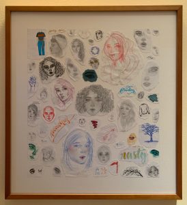
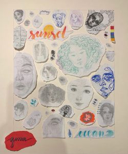
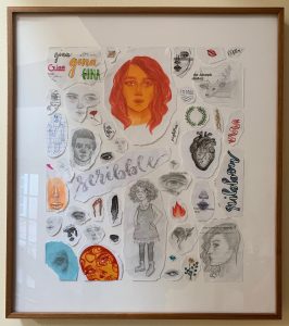
“I ripped out all the doodles from my schoolwork from the last couple years to show how frequently I use doodling as a way to cope, even in class. These 3 frames include some of them.”
“Its one line represents art as coping, and the blank face represents how people can look blank on the outside when on the inside, they’re struggling.”
The measure of the modern or contemporary artist, to my mind, is dual: concept and execution. Or I should say, concept and/or execution. In earlier times when naturalism still reigned and artists still strove to perfect their graphic skills, execution was paramount. Today, concept is king. For the first time (in history), today, you can be an artist without knowing how do draw. (Sort of like Steve Jobs, who created and directed Apple without ever having written a line of code.) Unlike its historical precedents, contemporary and modern art can stand alone on but one of these two pillars; a measure of both is not required. This understanding, which would have sounded radical historically, is as we know widely accepted today. The urinal, which Marcel Duchamp propped up over a century ago and called it art, effectively closed the debate (for the converted, anyway, if not the antiquarians).
Of course, concept and execution can each be original, and, as above, the concept of an artist can be original but not its execution, or the style and manner of the execution can look fresh and original despite a well-worn concept. So it is all the more refreshing today to view the work of an artist who embodies all of the above—who can draw, etc., but who is also original, both conceptually and in her artistic styles. And startling, if the artist is but 16.
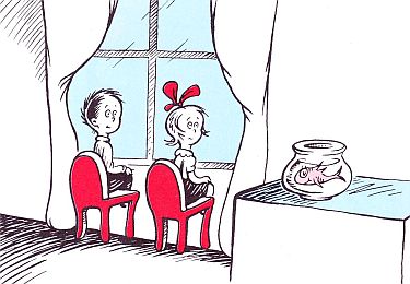
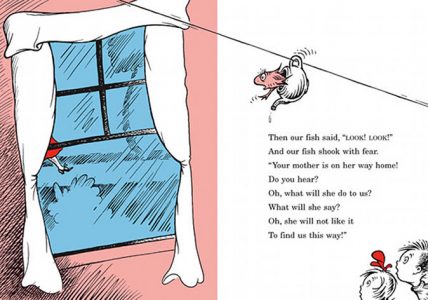
Not to put too fine a point on that word “original”. In art as in technology in general, everything is built on what came before. I think we’re all familiar with The Cat in the Hat, with the kids staring through the rainy window:
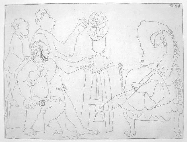
It would be absurd of course to compare Gina’s art to Picasso’s, but given that I have studied Picasso’s art far more than any other artist’s, such comparisons inescapably cross my mind. Though even in her doting father’s mind, she obviously has a long, long way to go before rivaling that master. But as Gina reaches certain milestones, I inevitably cross-reference them with comparable achievements in Picasso’s early development. Picasso in his teens was not yet primarily distorting reality–that mostly began later in his Blue Period, his first major, original style. Admittedly, it is easier for a budding artist today than for Picasso, at least in the sense that she has only to look back at all the innovation that preceded her for ideas and inspiration. And Picasso more than anyone exploded the world of possibilities in his field. Hindsight could however cause an artist to lose courage, daunted by the vast extant pantheon of art. Much like that prescient director of the US Patent Office, who (legendarily but more likely apocryphally) maintained way back in 1898 that his office should be closed, because everything that could be invented already had been. So Gina, like other contemporary artists, gets to climb on Picasso’s (and other artists’) back, building upon his numerous conceptual innovations while secure with the assurance that they could distort visual reality and yet not be scandalized for it, unlike the fictional artist Frenhofer:
(To find the story behind this Picasso etching, Atelier du sculpteur (Bloch 1118), scroll about 2/3 of the way down this page.)
Rather than explore the broader philosophical question of what exactly defines originality, at least for now, Through the Glass seems suitable as a case in point to demonstrate Gina’s original artistic qualities, in all of the above senses. (If one finds themselves wrestling with the term “original”, for practical purposes perhaps it would do to substitute the word “unusual”.)
Gina’s conception started simply, when she was very young, during that kind of cold, rainy car ride when it’s warmer in the car than outside, and condensate forms on windows, obscuring vision. While raindrops ran down the outside of the windows, on the inside, Gina’s finger would roll some condensate into a drop, which would then slide down. To pass the time, Gina and her kid sister would race their drops as they slid down the window. I imagine Gina was amused by the irregular course they took and the contrast between the blurry condensate and the clarity in the wake of each drop. Flash forward a decade or so, when Gina painstakingly captured the look of these droplets, laboring over the appearance of each drop, each side of which looked different, depending on whether it reflected the incident light or was in the relative shade. (I’m a little sketchy here—she studied how to represent those droplets at length, not me.) So Gina recreated the look of this rainy window, including a clearing like we’ve at times all made with our own fingers on glass condensate. I watched (intermittently) while she labored over the numerous droplets, literally for hours, depicting the light within each individual droplet just so.
The clearing in this rain-obscured window through which the girl gazes, itself a rather unusual, if not unprecedented, subject, served Gina as a potent metaphor for having at last attained some clarity and hope, if not resolution, after the dark period following her close friend’s sudden death. The evolution of this artwork thus exemplifies how innovation may be predicated upon past experience, and how one can draw upon not only major life events but also seemingly trivial ones to create something beautiful and original.
During Through the Glass’s long gestation, Gina naturally had been improving her technique, and had also toyed with elaborating various styles. She had been making art almost every day. In so doing, she bent much of her art, including many doodles as well as larger pieces like the one called Blank (illustrated here), to the task of reinventing the human face and less often other subjects. One can trace a line from those experimental doodles to this finished piece. Perhaps you’ve found her rendering of the face and hair rather moving, and hopefully also artistically mature. But if you’re at your device and looking at a smallish digital image rather than one of the large prints we’ve made of this artwork, be sure to zoom in on the face. In doing so you’d see the complexity of the facial rendering, her own, subtle “swirly” style du jour (best seen in the close-up above or by zooming in on the higher-resolution image below) with which she shaded and adorned the face, which fits at least my working definition of artistic originality. (This would be better performed on the hi-rez photo below than the lower-rez banner photo on top.) Facial swirls, after all, are not exactly human.
